
Building a Indie Game Studio
Crafting a Community-Driven Indie Game Studio with zero budget.
In this page you will find mini and full case studies I did for fun, based on all my past clients. These case studies show off many of the skills shown in the index and the experience talked about in the about me page.
Branding mini case studies on how I would do the branding for a company if I had all the freedom in the world.
A study of the work I did and do with some of my clients, showing off there amazing companies.
.png)
.png)
.png)
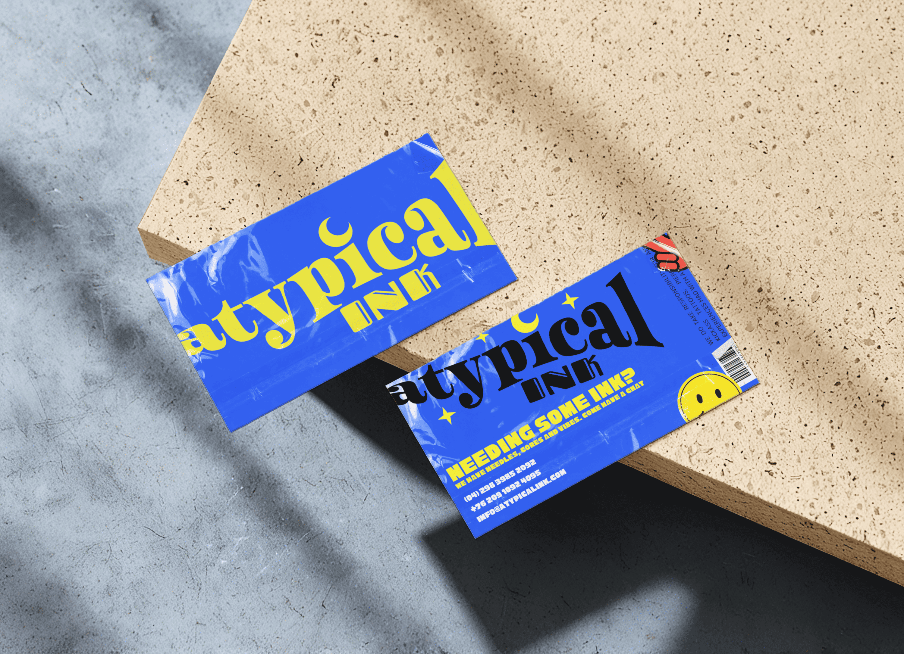
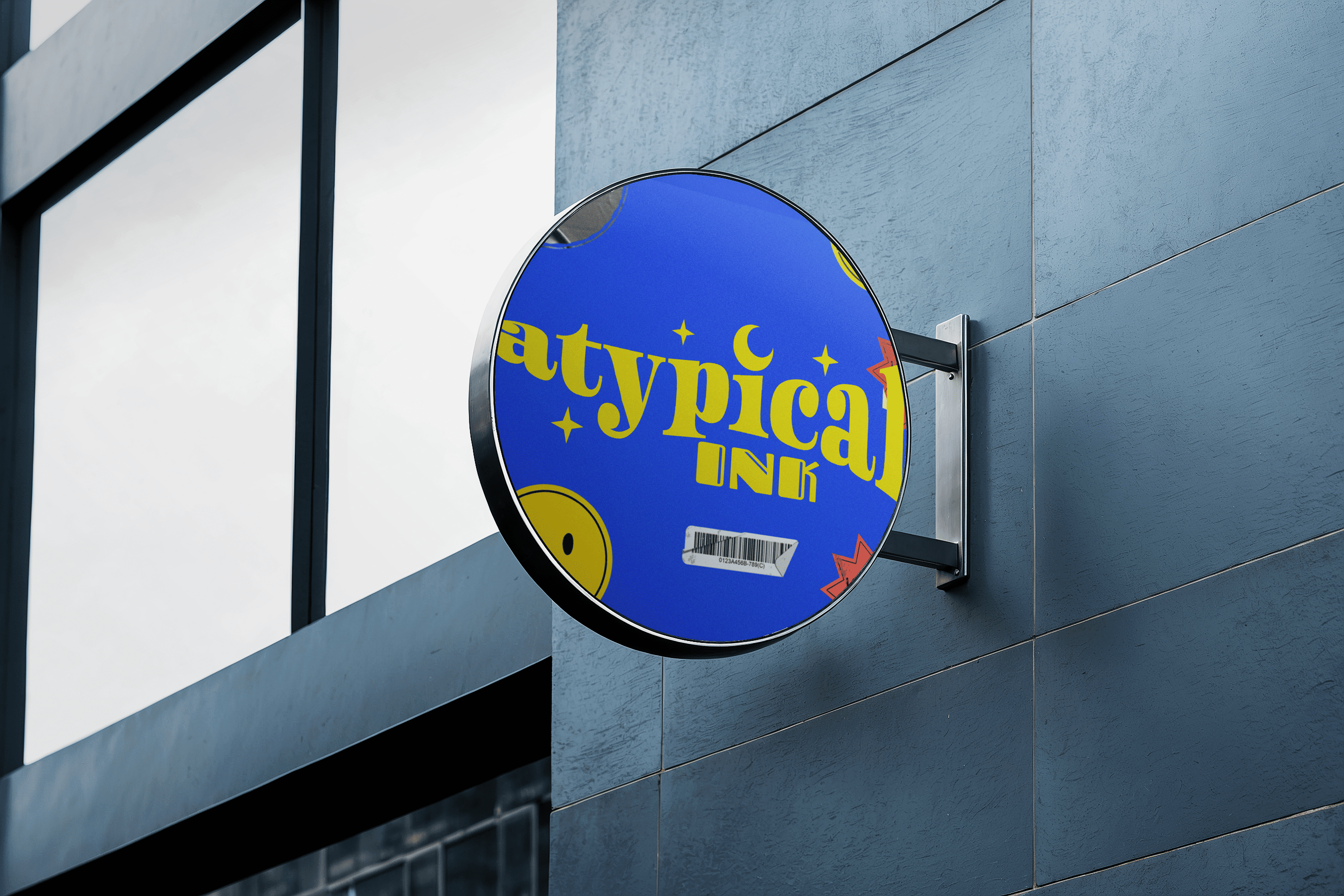
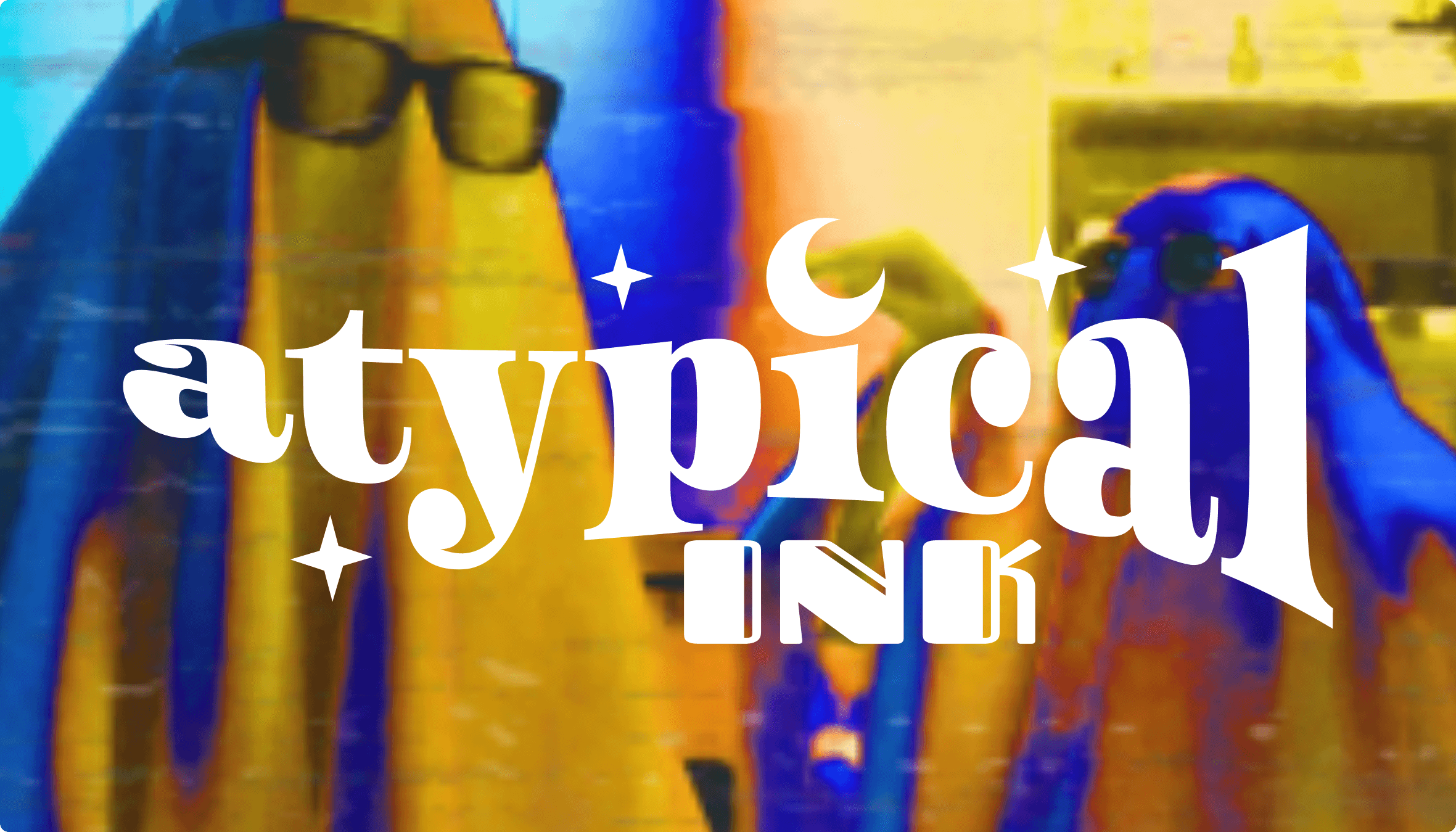
The idea behind atypical Ink is that it's a fun, safe space for neuro-spicy and artists a-like where people where go to get tattoos done, get inspired, hangout and socialize. For the naming I decided on "atypical Ink" as a reference to the atypical brain, which is the scientific way to refer to a neuro-spicy person's brain. As for the aesthetic side, I was inspired by the client who inspired this case study and wanted to use primary colors, as well as some mystical elements.
.png)
.png)
.png)
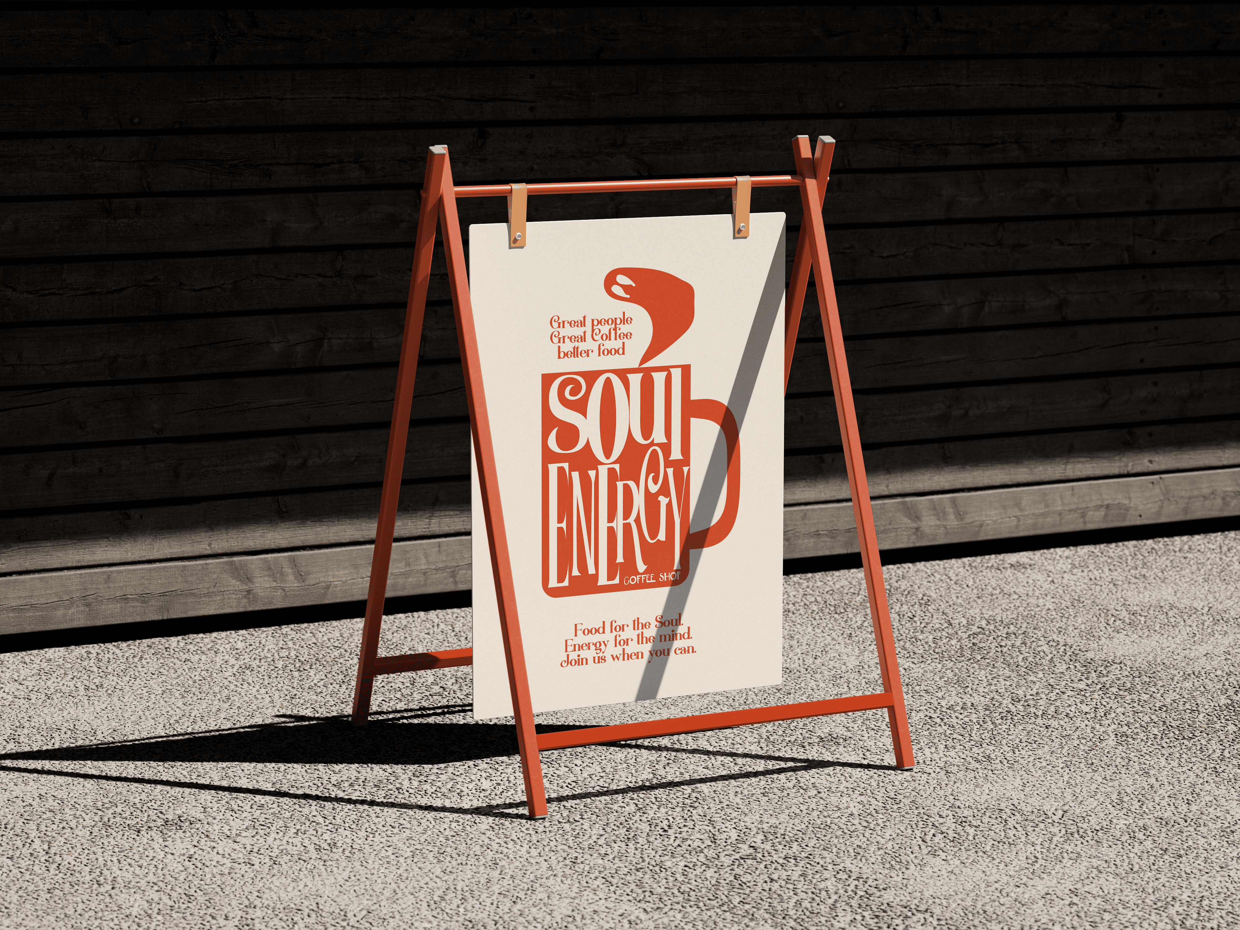
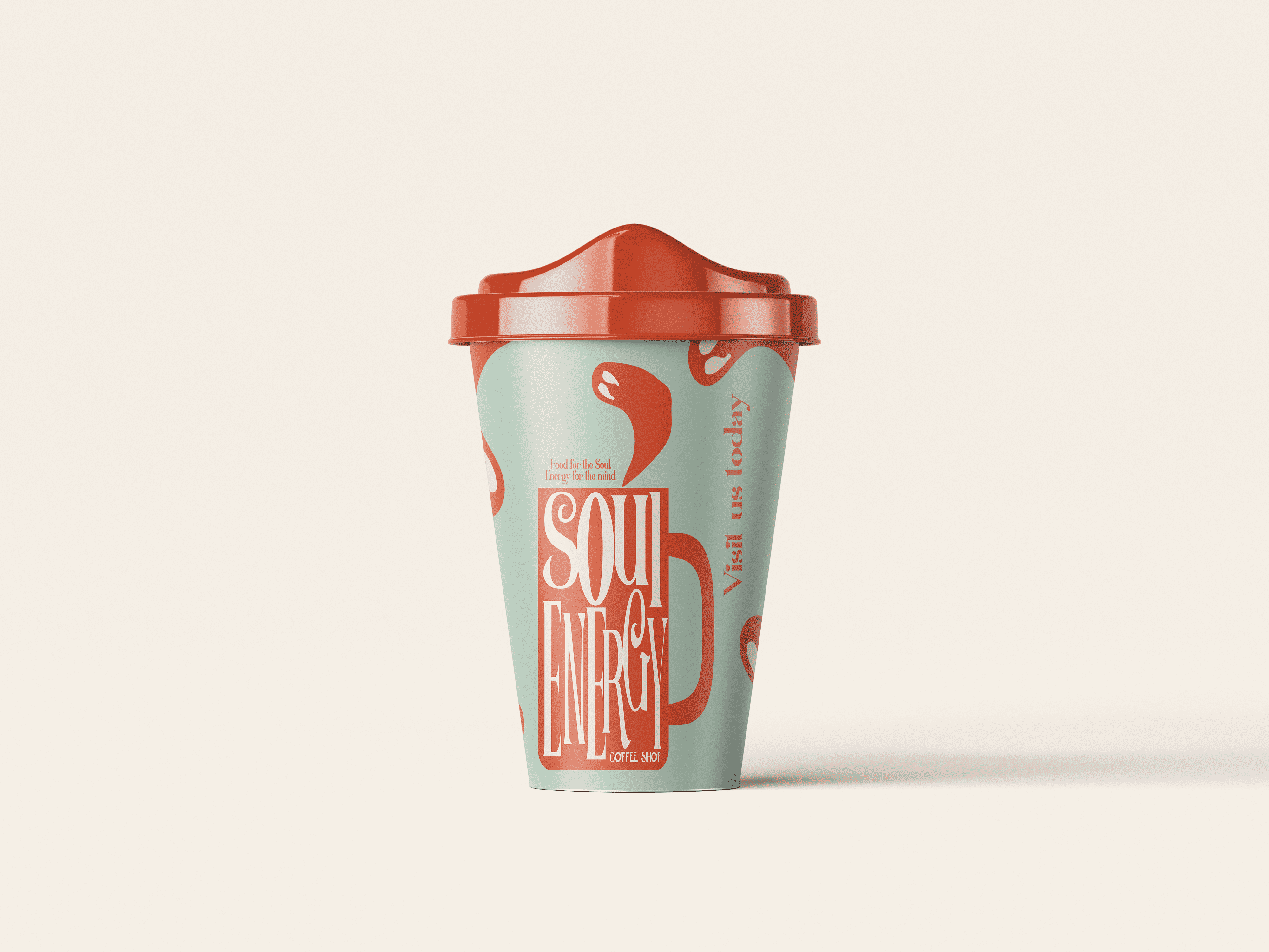
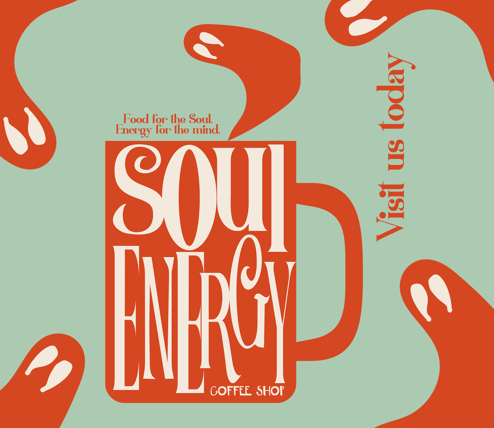
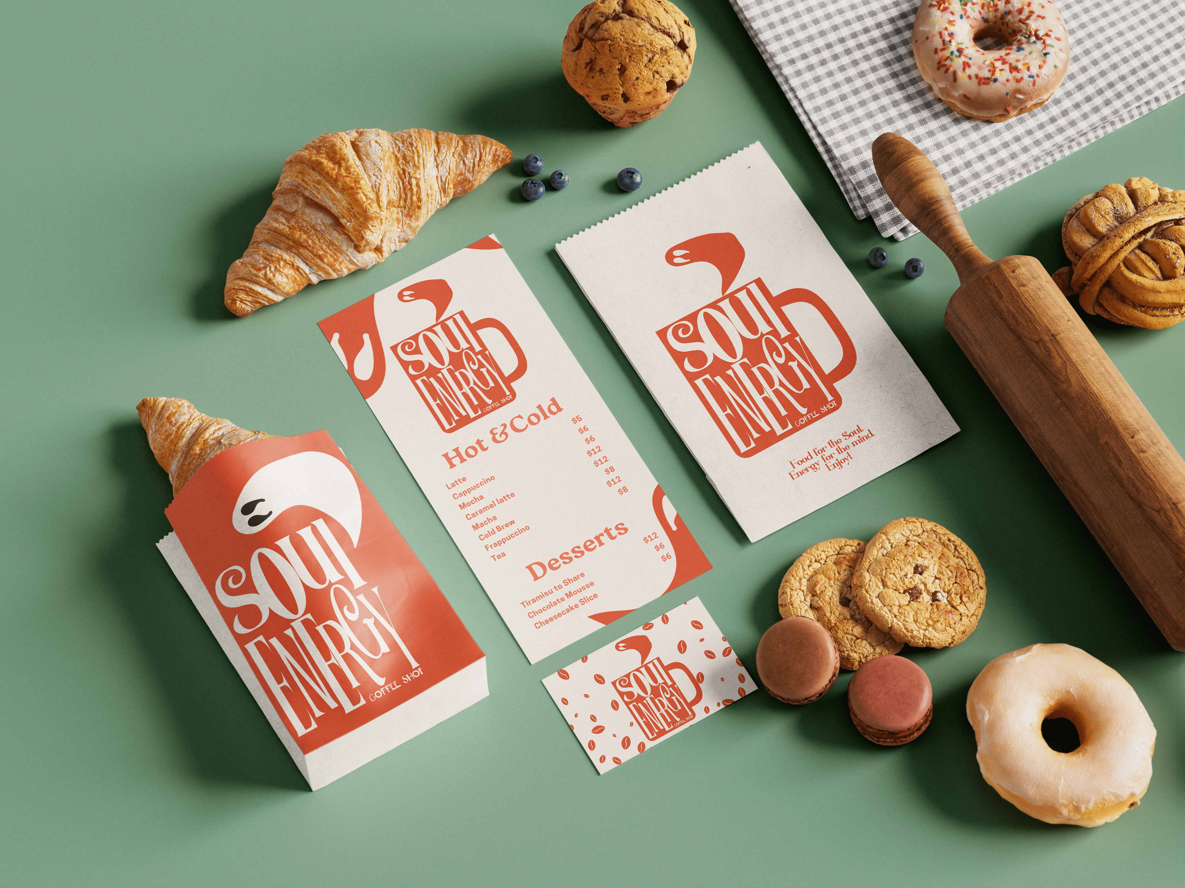

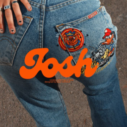
The vibe here was colorful while staying adult and cool. One of the main inspirations was the Friends TV show aesthetic, as well as the cozy core aesthetic with it's mystical witchy vibes and autumn colors.
The most significant lessons from this experience are the importance of patience and genuine care in building something from the ground up. These elements have been critical in fostering momentum and a strong community that supports the studio’s long-term vision.
Untitled Game Studios began as a university project among friends who realized they had the skills to create something more significant. I was brought on to provide structure, branding, and community engagement. We established an iconic brand inspired by retro games, which aligned with the studio's creative vision. My focus then shifted to building their online presence, including a website, social media, and engaging content that captured the studio's voice. By fostering a strong sense of community through events and consistent communication, we have positioned Untitled Game Studios on the cusp of releasing its first full game, with a dedicated fan base and extensive press interest.

No Marketing Funds: Relied on in-house skills paired with fully organic marketing and social media.

Learning & Improvisation: Extensively learned and improvisation using free resources.

Self-Taught Skills: Developed the website by learning HTML, CSS, JavaScript, Bootstrap 5 and backend processes from scratch.
We employed a frictionless marketing strategy rooted in deep community research and connection, a concept I refined in my master’s thesis. For four years, we focused on creating entertaining, non-commercial content to build a loyal following organically. This approach avoided traditional advertising and paid promotions, relying instead on authentic engagement and value-driven content.
 (1).png)
.png)
 (4).png)
The studio has gained over 1,500 followers across various platforms exclusively organically.
Redrun Alpha demo received 95 downloads and generated €35 in revenue without any requests.
Droian is the studio's first full game and they expect even greater success than Redrun once Droian is released on Steam.
UGS attracted attention to their games and content, with many streamers and indie devs trying and enjoying their alpha demos.
The key lesson from this project is the importance of thorough communication and understanding the brand’s core identity before making changes. Effective rebranding is not about change for its own sake but about making thoughtful, meaningful updates that respect and enhance the brand’s legacy.
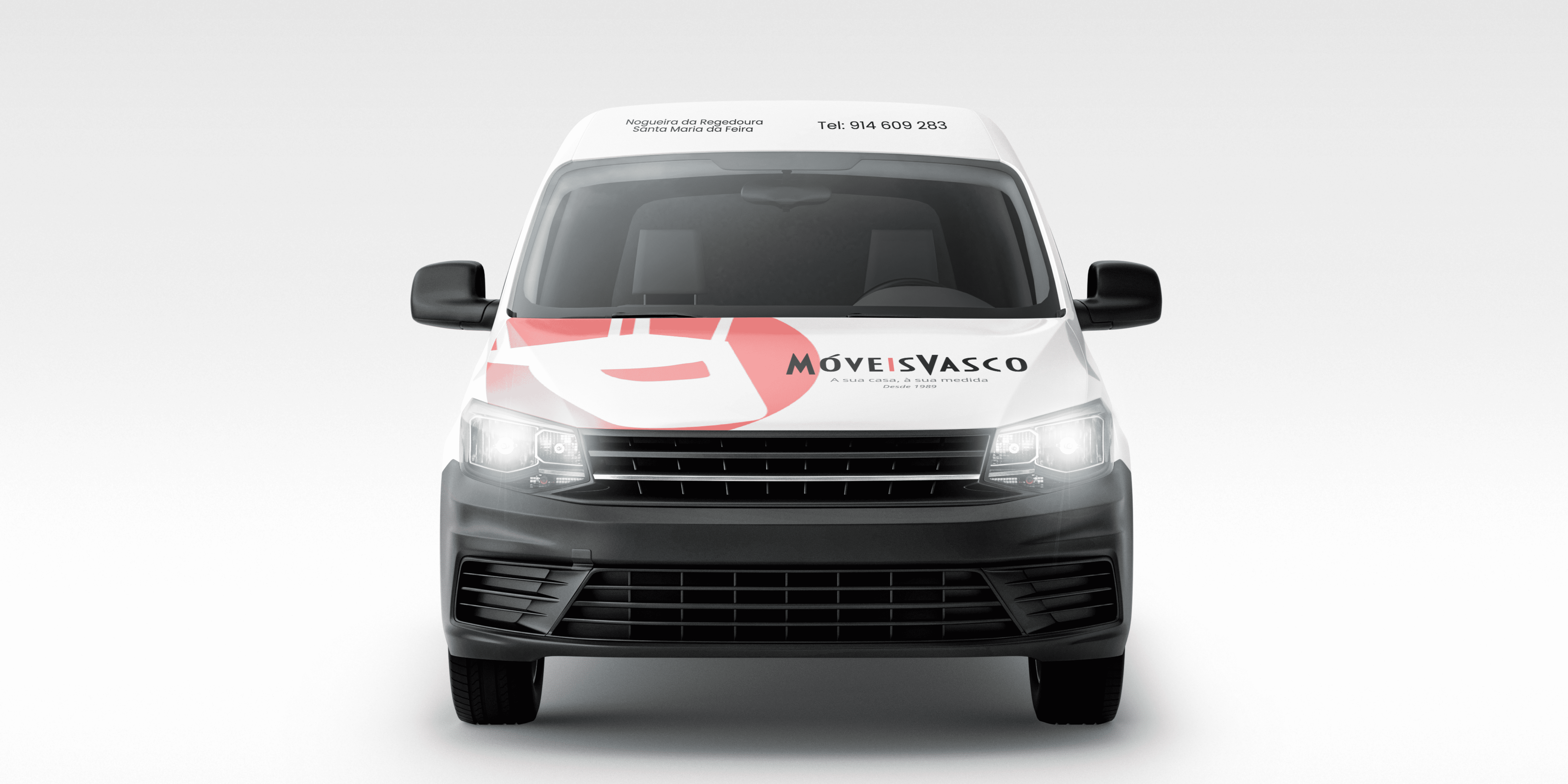
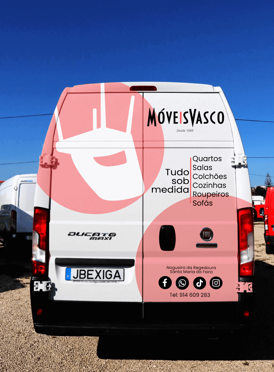
A long-established store in the Porto region of Portugal, with roots going back to the 1970s, sought to modernize its brand while retaining its iconic identity. The owner's son approached me with the idea of rebranding as part of a project to repaint their delivery trucks, hoping to elevate the brand for the 21st century and the digital age. The challenge was to update their brand kit, create truck mockups, and potentially develop a new website—all while ensuring the brand remained familiar and recognizable to its multigenerational clientele.
The primary challenge was identifying and preserving the brand's essence, which had made it iconic to both the owners and their loyal customers. Striking the right balance between modernity and tradition required deep understanding and open communication.
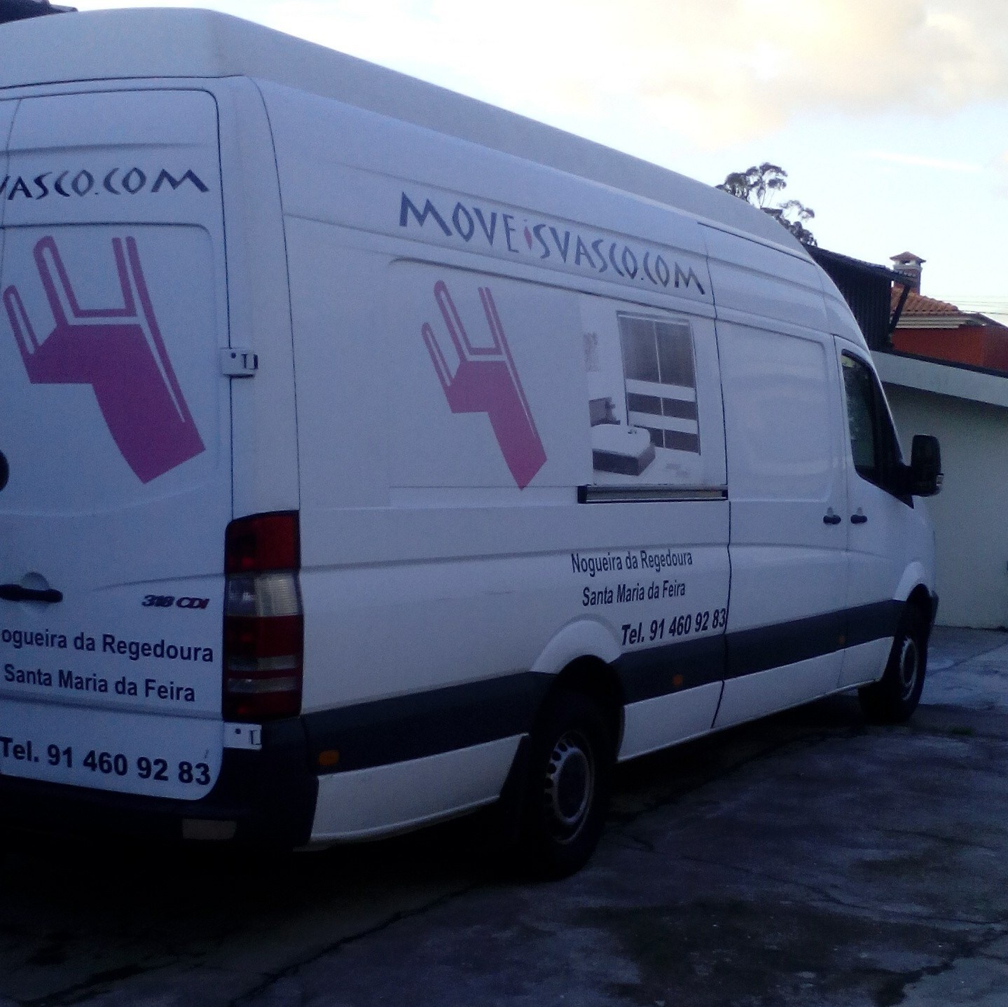
To address the rebranding, I first identified the key elements of the brand: the upside-down chair logo and the distinctive, yet dated, font. I refreshed these by creating a new chair graphic inspired by their best-selling chair and updating the font to a more modern and chic style that still echoed the original.
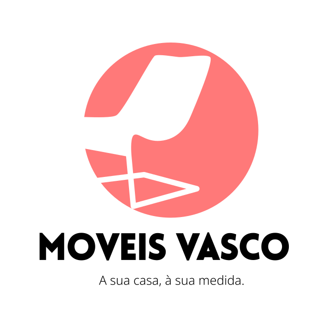
While the full impact of the rebrand is yet to be seen as the trucks are still being repainted and the website is in development, early feedback from the owners has been very positive. The careful balance between innovation and tradition appears to be well-received, suggesting that the rebrand will resonate with both long-time and new customers.
This project underscored the importance of deeply understanding and respectfully engaging with a niche community. It also highlighted the value of strong visual branding and strategic messaging in transforming a product's market perception. Additionally, the experience allowed me to further hone my skills in Photoshop and gain deeper insights into the preferences of younger generations.
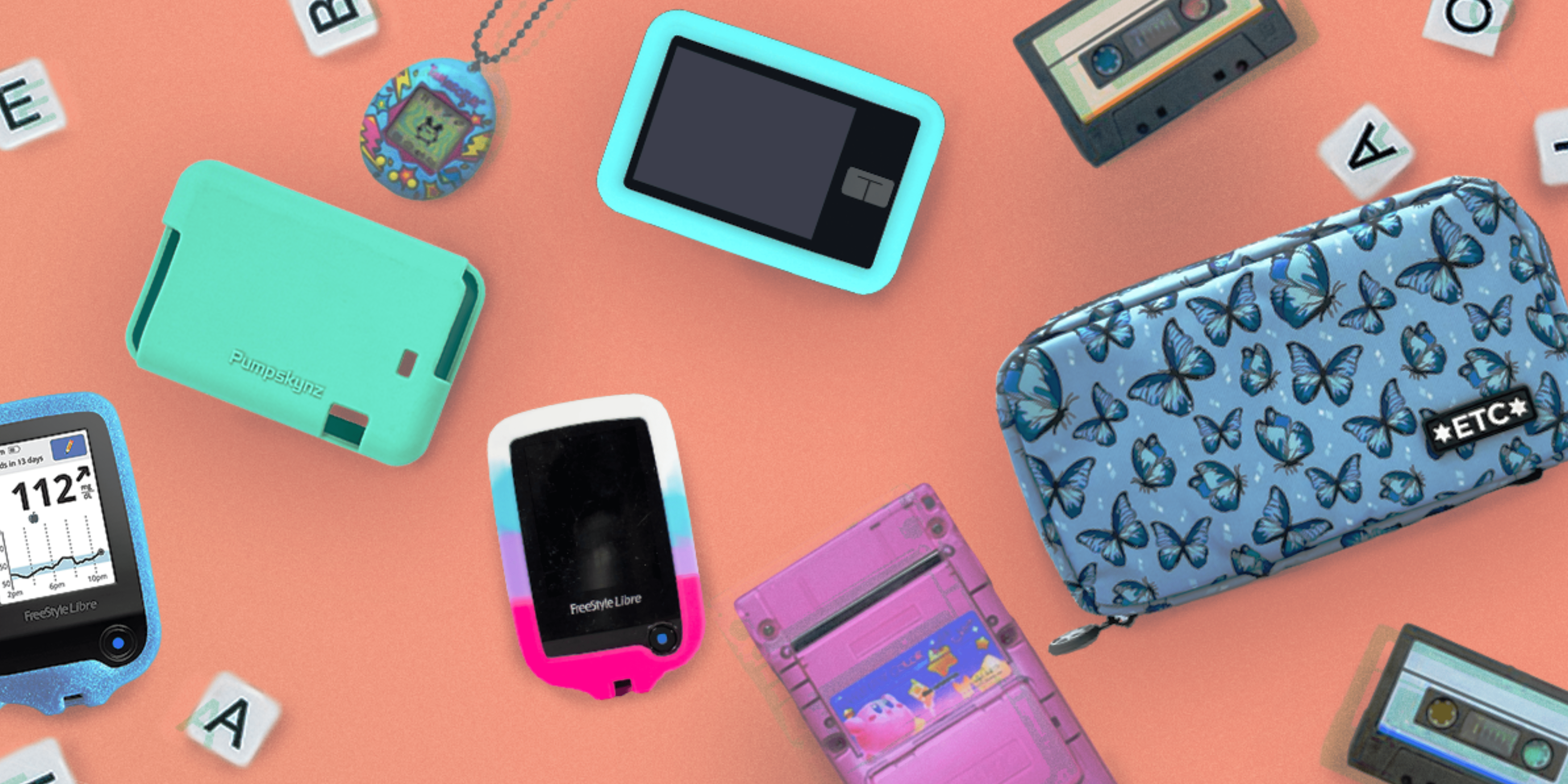
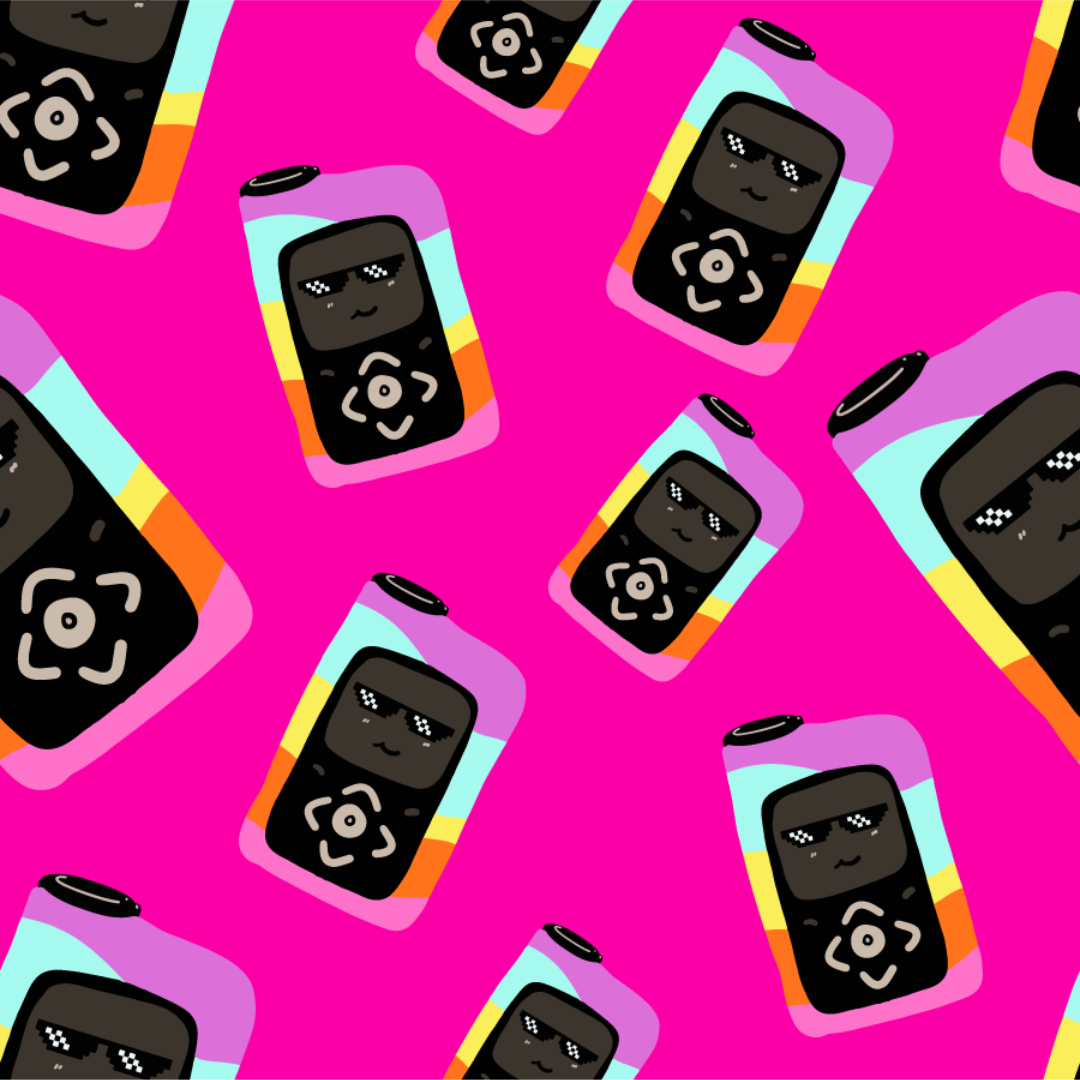
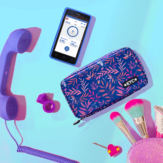
This brand initially focused on creating silicone covers for essential insulin pumps and other diabetes care devices. Despite the product's importance, sales were minimal, primarily occurring at diabetic events and through word-of-mouth. The brand lacked a strong online presence and had minimal engagement within the diabetic community. Additionally, the promotional materials were homemade, which made the products appear cheap and diminished their perceived value.
.png)
.png)
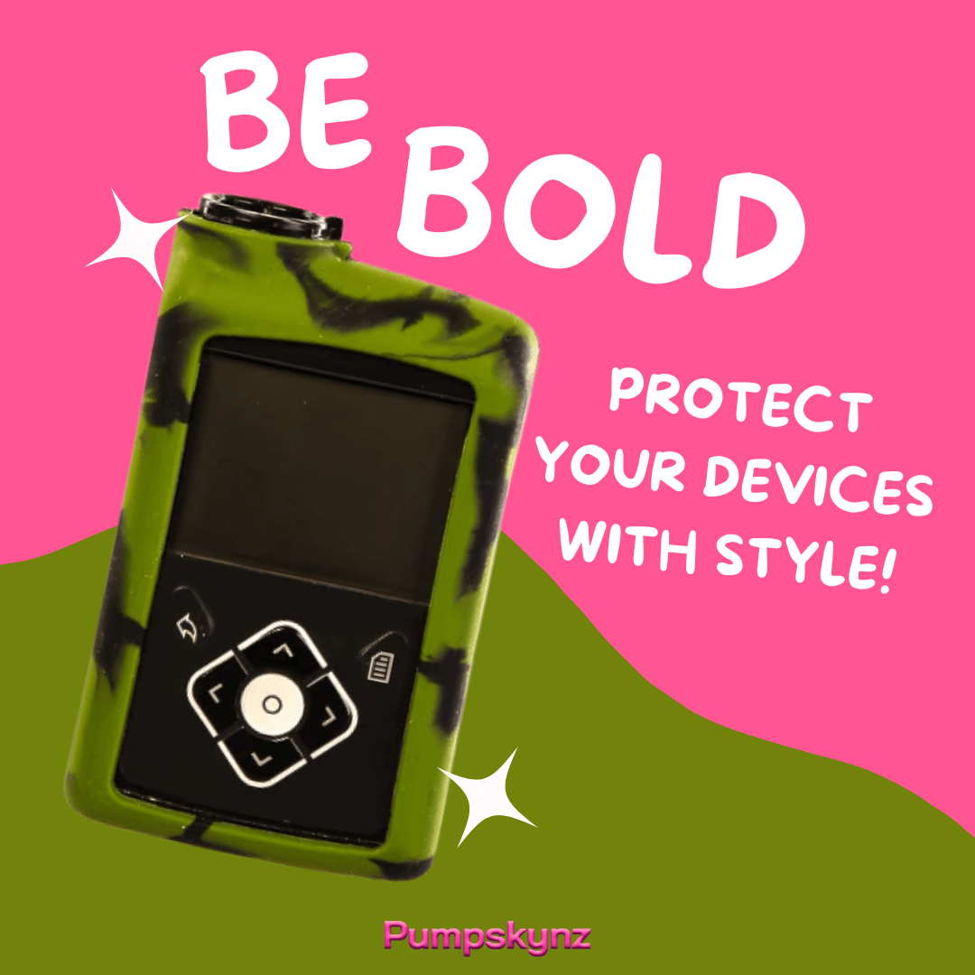
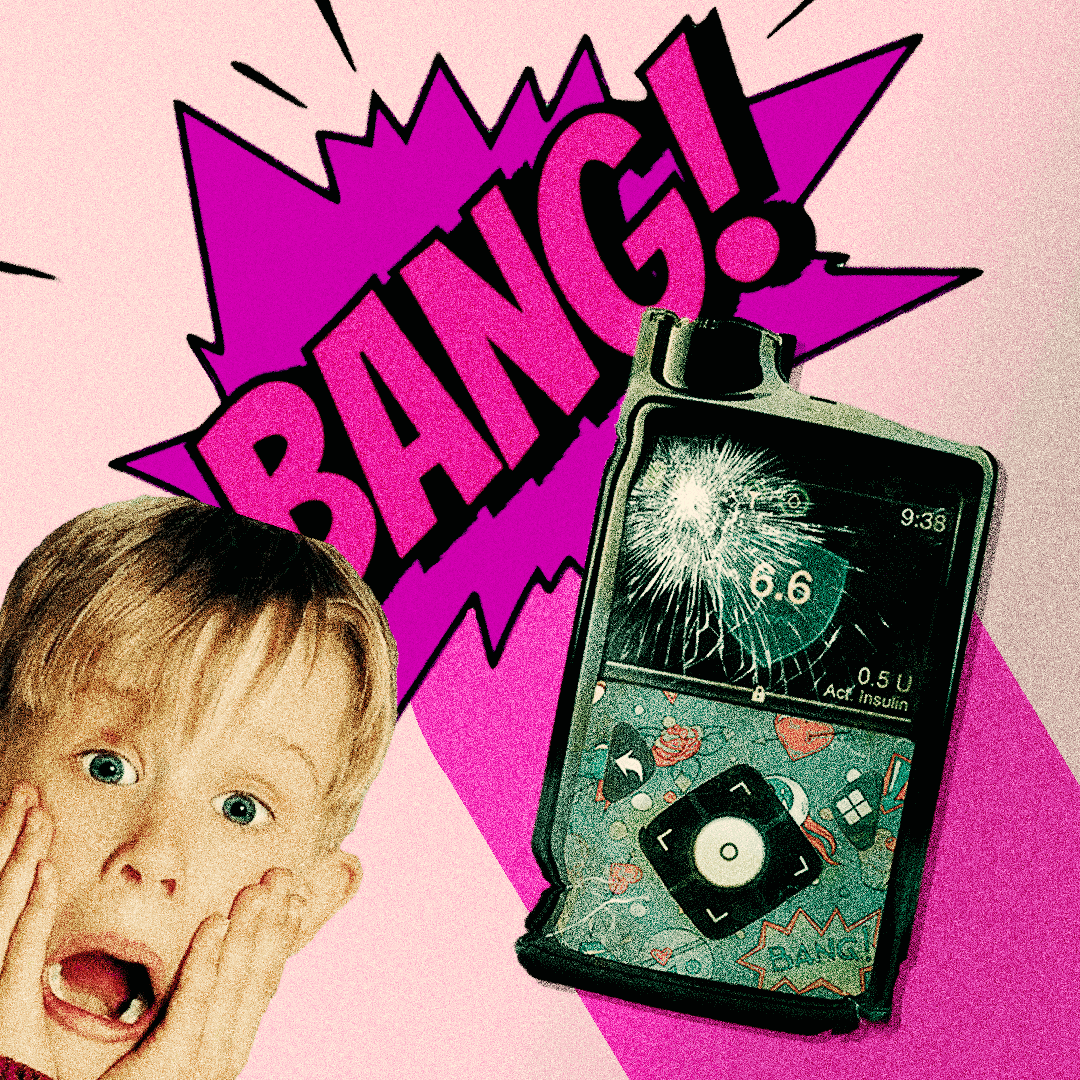
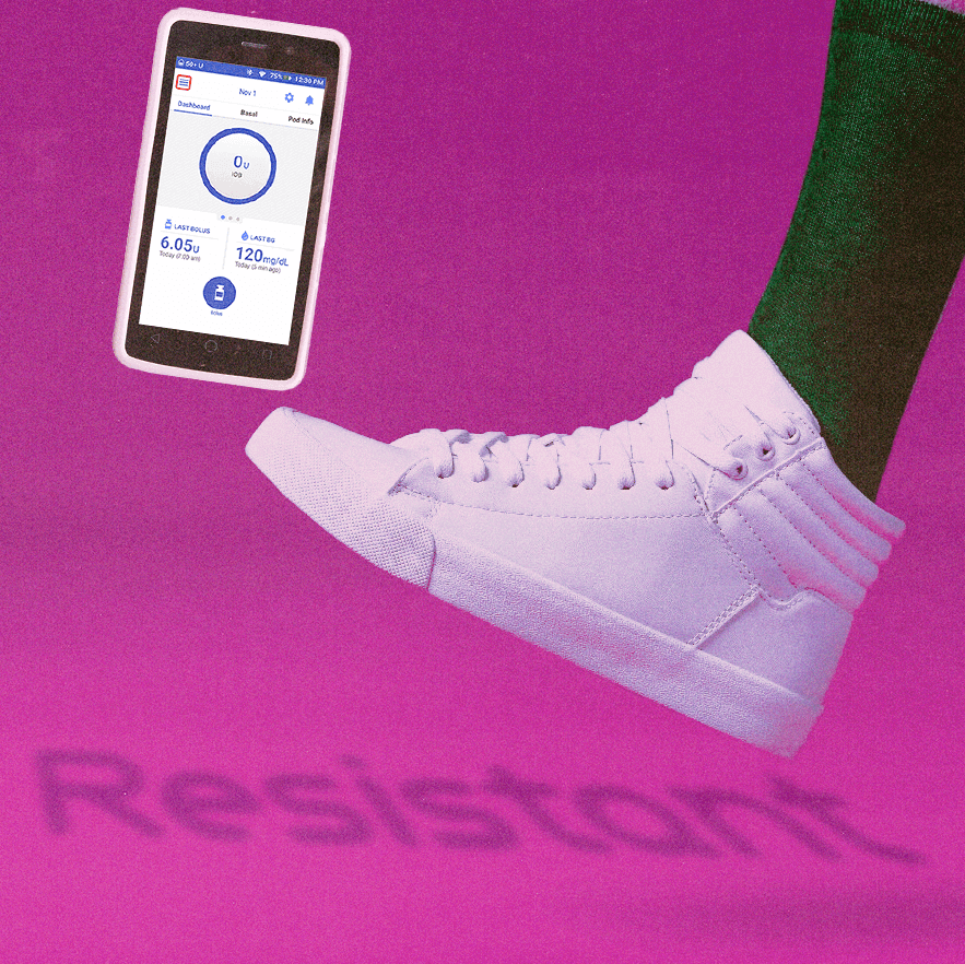
The product initially struggled with the perception of being a non-essential accessory, leading to poor market reception, especially as potential customers balked at the price. Additionally, the brand faced the challenge of effectively engaging with the diverse diabetic community. To overcome these hurdles, the brand refreshed its visual identity, revamped its website into a community hub, and reworked its messaging to highlight the product's practical and emotional value. This new approach was extended to social media, where updated, vibrant promotional imagery targeted Gen Z and Gen Alpha, despite a limited photography budget.
Transitioned from a niche accessory provider to a lifestyle brand essential for daily diabetes care.
Achieved a +235% increase in sales due to successful rebranding efforts.
Secured collaborations with two of South America's largest diabetic influencers and partnerships with two major diabetic companies.